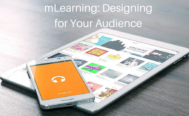
The audience for a mLearning course has different needs and obstacles than that of a traditional eLearning course.
In today’s post, we’ll look at a few key concepts you need to keep in mind to design a course that works for one enrolled in a mLearning training.
Bite sized mLearning
As students and other participants use their personal mobile devices for access, they will most likely be paying for a limited data plan. Hence, the longer the session, the more data is used. Also, resources like video consume a lot of data, so remember to use these features judiciously.
Since your learners can use a mobile learning application practically anywhere, it helps to keep the lesson plans short and easily completed within a short time frame. Even with larger, more complex topics, break the information down into bite-sized sections that can be completed at the user’s leisure. Your audience is more likely to feel compelled to complete a 5 minute section than a 30 minute course.
Bite-sized learning is a nice approach, even in traditional eLearning courses. However, it is an absolute necessity when designing mLearning courses. This is due to the fact that your learners will typically only have a few minutes to acquire the information within your mobile training course. In addition, they may be dealing with a number of distractions while they are trying to access the modules, especially if they are on the go.
Remember: Keep the text short and sweet, the images relevant, and break everything down into bullet points. If you have key points that you need to highlight, then use custom fonts or bold them so the learners know exactly what information they need to absorb and retain without sifting through lengthy pages of text.
Ensure the content fits the environment
Tablets and mobile devices in general might often be used at home or in the office, but they are first and foremost meant to be used on the go. Your users might be riding the subway to work or sitting outdoors, and they’ll want to access your course from those places, too. This is why you need to make your content work in situations where there is limited or no connectivity.
Some things are plainly harder to do on a tablet, like having precise control over pointing at things (fingers are larger than a virtual mouse pointer). Having many websites open is also more cumbersome without tabs and multiple windows.
Study how your users interact with your content on mobile devices. Pay particular attention to where their use differs from what they’d normally do when accessing your website from a computer and apply what you learn to your course design.
Put yourself in your learner’s shoes. Determine the tasks they perform on a daily basis. You can learn a lot by surveying them at large, but you can learn even more by watching them in the wild. Take notes on how they work and their behavior with mobile devices. Try to create a solution that fits those behaviors rather than asking learners to adopt new ones.
mLearning: Keep the audience in mind
It’s very easy to get caught up in technical specifications and creative solutions, but at the core you are designing for human interaction. Keep focused on what the users need to learn, what environment they are learning in, and what is going to make your training most effective.