This post is part of an eight-part series on eLearning and graphic design. You can look for this series every other Thursday here on our blog (and sharpen your skills with each and every post.)
With that said…
We’ve talked before about graphic design as a whole for eLearning development, but today, we’re going to focus in on one specific topic: Fonts.
While choosing a font for your eLearning course seems like a simple decision, there’s actually quite a bit you’ll need to take into consideration before making your final choice. And because it’s a major piece of the eLearning course itself—it has a big impact on the overall look and feel of your course.
So where do you even begin? Let’s start with the basics.
Simplicity over Style
While it can be tempting to use fun and stylish fonts, the main objective you have to remain true to is readability. If the font is distracting from your content, the learner won’t retain the information as well.
Ask yourself, “Is this font easy to read? Is it too small or too stylized?” Always select a font that’s easy on the eyes—your readers’ eyes are under enough strain looking at a computer or mobile device. Don’t make it harder!
Serif, or Sans Serif?
The two main kinds of fonts you’ll be choosing from fall into two categories: Serifs, which have small finishing strokes at their ends, or sans serifs, fonts without the extra embellishment. There’s no right or wrong, but many designers stick to using sans serifs for heading and serifs for body text.
Research showed that serifs were generally easier to read, according to a study by the Software Usability and Research Laboratory. Serif fonts such as Arial, Tahoma, and Veranda took the least amount of time for readers to comprehend. Again, remember: The correct font is the one that’s most easily read by the learner.
What does your font say about you and your client?
People associate personality types with different fonts. It sounds strange, but it’s true.
Complex explained this concept in further detail by showcasing fonts and their corresponding connotations. Here are a few examples:
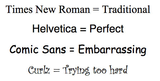
The point is: Think about what you want your font to say about you as the designer and your client as a company. Should the tone be hi-tech? Formal? Quirky? Explore different options to see which one best fits the feeling you’re trying to achieve.
Pick Three
A good rule of thumb to keep your overall design simple and clean is to choose no more than three main fonts—and stick with them throughout the course. When too many fonts get in the mix, your eLearning course loses a sense of cohesiveness, and the design suffers. Use one main header font, body font, and maybe have one extra for embellishments.
Handwriting Fonts
While you obviously don’t want to put paragraphs of text in handwriting fonts, there are places where they work well. For example, if you’re showing a whiteboard or chalkboard with writing on it, normal computer fonts look pretty lame. Handwriting fonts can add that element of realism.
 Handwriting fonts are also great as a personal way to make call outs. It gives the feeling that you jotted a note right on the image just for your learner.
Finding your Font
It will take a while to pin down which fonts are most effective within your eLearning courses, but don’t be afraid to experiment. Don’t get too crazy, and don’t start adding new fonts for the sake of adding them (more isn’t better.) Keep legibility front and center, and use your creative flair for those nice personal touches.
What is the most-used font for your eLearning courses?