Sometimes it seems that great presentation skills are a personality trait…some people have them and some don’t. Certain people have infectious personalities and dynamic speaking abilities made to stand up and conduct classroom training. And then there’s the rest of us. Fear not! While it isn’t realistic to think you can transform your instructors into a mini Tony Robbins, great training materials can make a huge difference in the success and engagement in your classroom training.
I’m not a trainer or a subject matter expert, but the Instructor Guide was so thorough and well done, that even I could present the materials like a pro.
In a recent project for a client, we created high-end ILT materials, and it was amazing the reception they received. The client had three main goals. The first was to enhance the professionalism of the material look-and-feel, so they could use them both internally and externally. The second goal was to create a robust instructor guide so they could ensure everyone was presenting the materials consistently. And finally, they wanted a customized participant workbook to up the engagement level of the learners.
Looks Are More Than Skin Deep
This goal admittedly had a shred of vanity in it; the client wanted something that looked professional and that they would be proud of when presented to clients. But a good looking course is more than just looking pretty. Proper visuals add to the learning process by helping maintain engagement. Things that are visually stimulating keep our attention better. This is part of why infographics are so popular.

So a good looking course isn’t just about professionalism, it’s also about engagement. But furthermore, if a course looks thought out and well executed, people tend to respect it more and trust in its content. If you create something that looks and feels homemade, people tend to assume that goes for the content, as well as the visuals. That’s not to say everything needs to be super high-end, but the visuals should let people know that thought and care was put into every aspect of the training experience.
Simon Says: Say It Like This
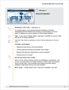
The second goal of the course was to create a robust instructor guide. This client had multiple instructors, and not all of them were at the same level in terms of their experience. Some knew the content inside and out, because they had authored the original course. Others were new to the area and were just getting up to speed. Despite this disparity, they wanted to ensure everyone was delivering the same message. To accomplish this, we created a highly detailed instructor guide.

Rather than just throwing some talking points in the Notes panel of PowerPoint, we devised a set group of directives (INTRODUCE, ASK, DISCUSS, etc.) to guide the flow of each slide. Long blocks of prose are difficult to reference on-the-fly, and long bullet-lists often don’t have enough detail to be useful for all presenters. So, we struck a balance. The structure was easy to reference for more seasoned presenters who only needed periodic reminders of the flow. This structure was interspersed with additional material, so newer instructors had referenceable content to bolster their presentation. The end result was an instructor guide that was flexible and gave instructors of varying proficiency what they needed to successfully present the classroom training.
Workbooks Should Be More Than Just White Space for Notes
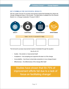
The most common “participant workbooks” are the 3-up that you can print straight out of PowerPoint. You know, the three slide thumbnails with the lines next to them. Sometimes this solution can fill a need (quick, cheap, easy) but for this project, the client wanted something structured around user engagement. So, we created a completely customized participant workbook that created structured note-taking opportunities.

The material in the workbook obviously followed the flow of the classroom training, and it even incorporated visual assets from the slides, but never the slide itself. For recognition, we would use a graphic, or the icons, or some other visual that anchored the workbook page against the presentation slide. We let the content dictate the flow of the workbook. So, some slides only needed half a page in the workbook, but some might have activities that spanned 3 pages. The result was an organic feeling workbook that was completely customized to the content.
The other unique aspect of the workbook was that it provided room for taking notes within a structure. We’ve found that users are FAR more likely to take notes when it’s in the form of completing sections versus just writing in blank spaces. We were able to provide portions of the content, and then rely on users to complete those areas. This also meant that the notes were targeted to the key points within the course. The end goal is for users to make cognitive connections during the training, and to leave with a resource that has value in referring back to.
Great Training Materials Can Make A Huge Difference
Great training materials certainly aren’t going to turn a hermit into a professional orator. And truly great presenters have a knack for making the experience great, almost no matter what. But for all the rest of us in the middle, great materials can make a world of difference. The right classroom materials can create a professional look. They can ensure consistency across presenters. And they can help to engage learners in all aspects of the course. Next time you’re designing a high-leverage ILT course, think beyond the 3-up. Consider whether more customized materials might be just the thing you need to up your training game.
